Compost Poster Triptych
The focus of this poster triptych is composting. Composting is a biodegradation method in which organic matter such as food scraps and leaves decompose into the soil.
Initial Concepts
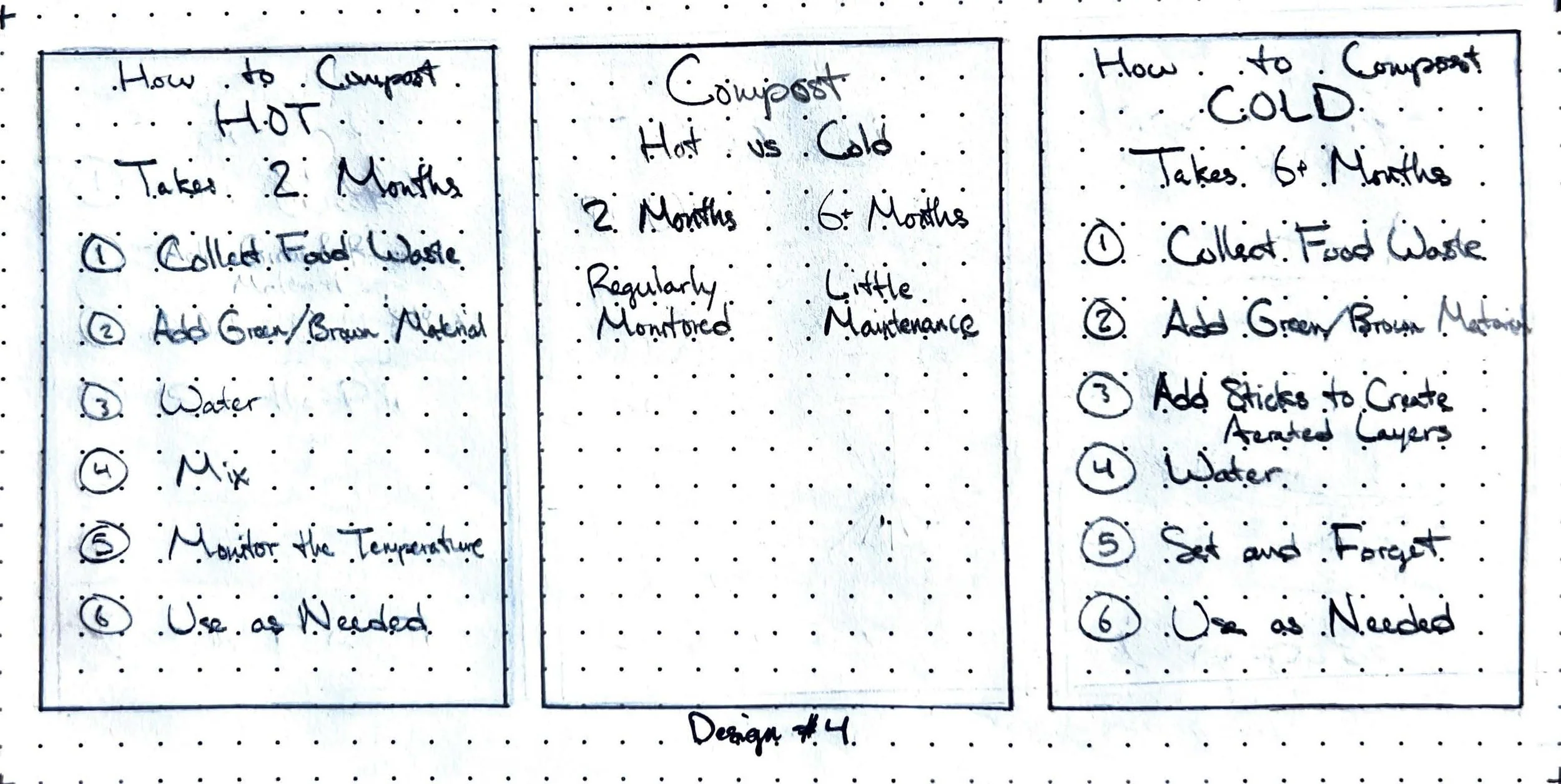
The theme of this poster triptych is compost. To visualize the necessity of composting, I started by designing concepts that showcased what would happen to the Earth if we did not start composting. From there, I chose to design a couple layouts that highlighted the different materials to compost, what and what not to compost, and how to compost.
Colors
Based on the theme of composting, I chose to incorporate green and yellow variations. Originally, the color palette was all green and too monochromatic, so the decision was made to incorporate a yellow-green to add contrast.
In this set of posters, the colors are too similar. More contrast is needed to further develop the design.
Hex: #DFE371
RGB: 223, 227, 113
CMYK: 2, 0, 50, 11
Hex: #43612D
RGB: 67, 97, 45
CMYK: 31, 0, 54, 62
Hex: #234D26
RGB: 35, 77, 38
CMYK: 55, 0, 51, 70
Typography
For the typefaces, I chose to stick with two types of Helvetica, as it is easily readable. Helvetica CE Bold was used for the headings, while Helvetica LT 45 Light was implemented into the body.
Digital Drafts
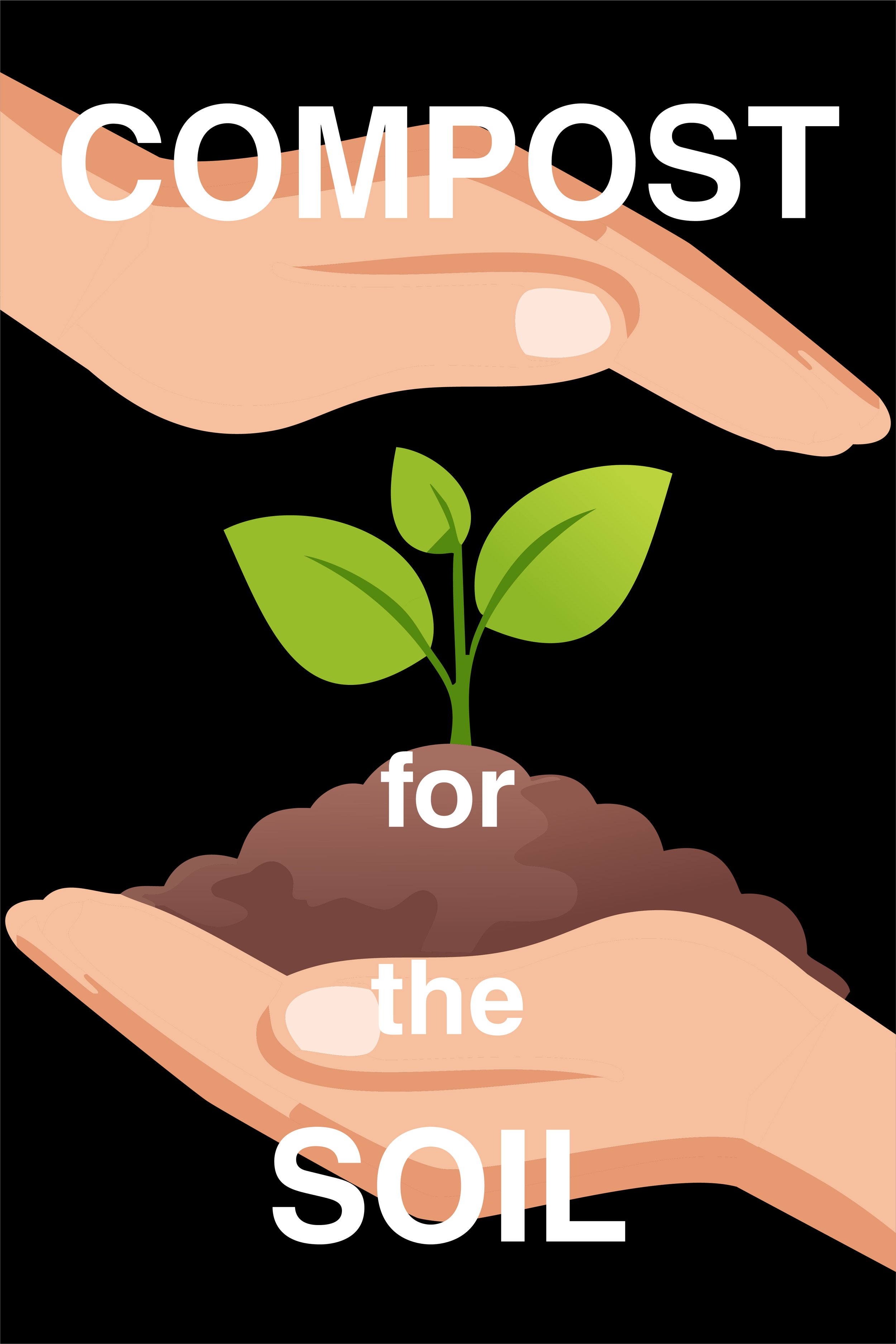
In this set of posters, the background color is too dark with the digital elements. The essential information about composting and the organization are not present.
This set of posters was developed towards the end, meaning the only difference between this version and the final is that I chose to remove the column in the final.
Final Iteration
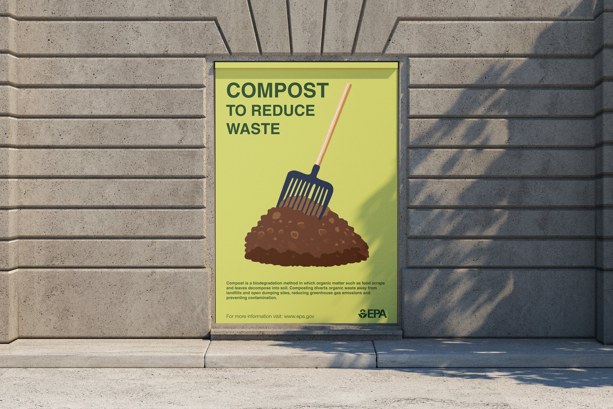
In the final iteration, the text stands out from the background, without too much vibration between colors. The visual elements in each poster have also been altered so they all fit with the same style.


