Cuties Advertising Design
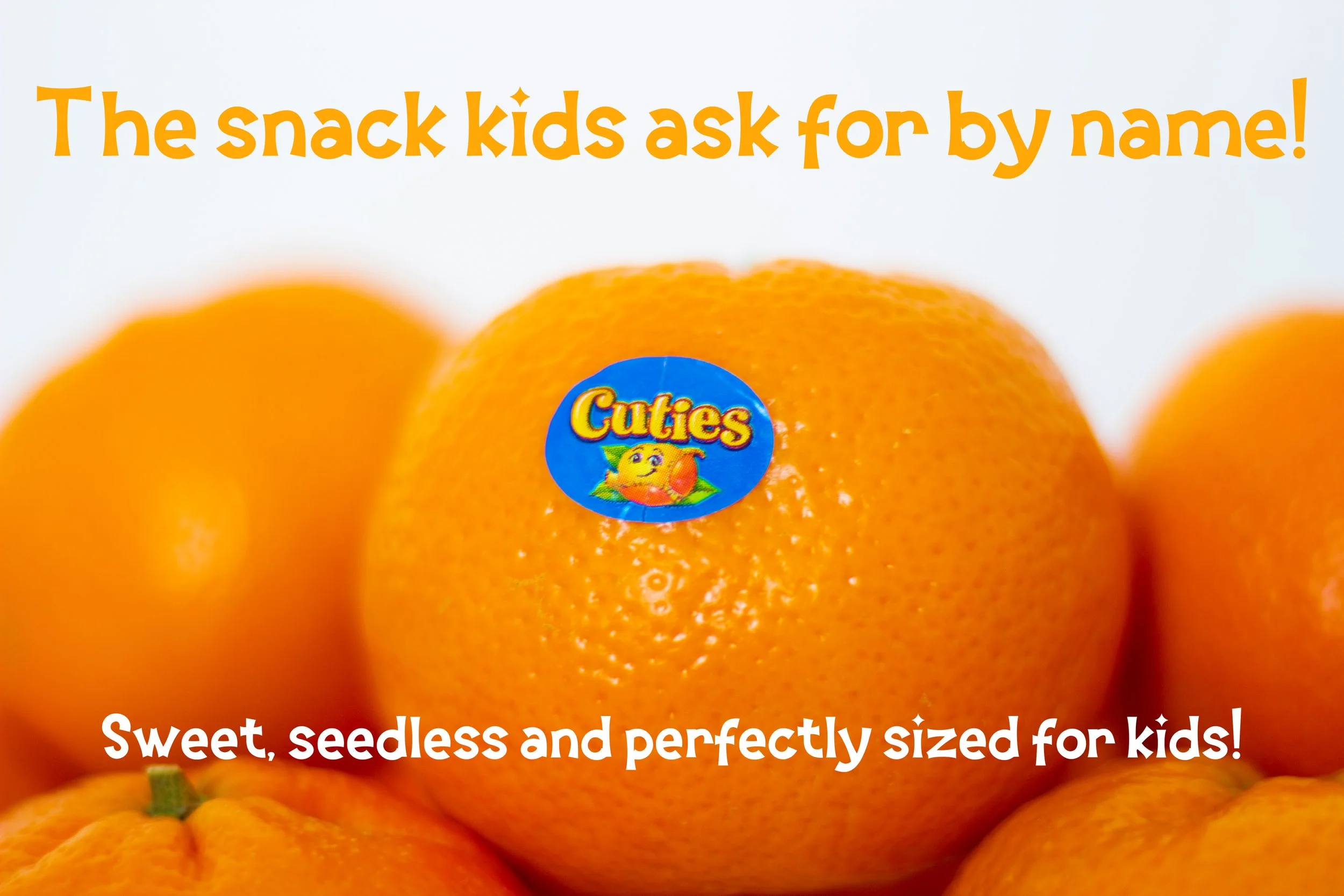
For this project, I photographed and designed an advertisement for Cuties clementines. Cuties is the original clementine brand, and it is owned by Sun Pacific.
Colors
Sticking with the theme of clementines, it made sense to incorporate different tints and shades of orange. I wanted the colors to stand out from the image without creating too much contrast and taking the focus away from the clementines
Hex: #F7AB49
RGB: 247, 171, 73
CMYK: 0, 31, 70, 3
Hex: #FFFFFF
RGB: 255, 255, 255
CMYK: 0, 0, 0, 0
Typography
For the font choice I chose Orange Juice to better fit the child-like theme, which is the way Cuties oranges have traditionally been marketed as. Typically, childish typefaces are not used in advertisements, but with children as the target audience, Orange Juice seemed to be a better fit.
Digital Drafts
In the digital drafts, I incorporated the typography and colors in various compositions, to further analyze which design worked and didn’t.
Final Iteration
The final iteration of the Cuties design utilizes orange and white colors. This maintains simplicity in the design, as the focus should be on the children.


